Color me…colorful
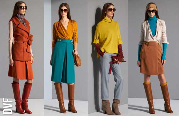
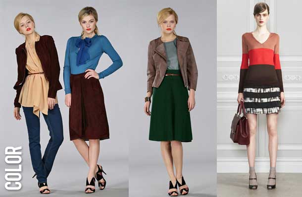
Designers have been showing some pretty fantastic color combinations in the Pre-Fall collections–lots of deep turquoises, burnt oranges, and emerald greens. Even with my predilection for gray, I’ve been searching my closet for colorful pieces I might not normally put together.
Fendi, Jason Wu
 The colors at Diane von Furstenburg made me swoon. Images via Style.com
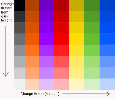
The trick is to wear colors that are in the the same tonal range (how light or dark a color is based on how much gray is added), but not necessarily the same hue (no matchy-matchy). Though even that so-called rule can be broken.
Any of the colors in the same row will work well together because they’re the same tone.
The easy way
The easiest way to experiment with unexpected color combinations is to start with a deep, cool color like midnight blue, forest green, or dark purple, and add an item or two in a brighter, warm color in the same tone. I took inspiration from this simple look from Ports 1961 and really liked the way the colors worked together:
Sorry for the lack of facial expression–darn camera only let me take one picture before it ran out of batteries.
This would work with dark green pants and a fuschia blouse with gray gloves, a purple blouse with orange pants and beige gloves, or any number of combinations. Have fun and experiment!
Tips
>Stay away from pastels unless you actually want to look like an Easter egg. Deep jewel tones have the most impact.
>Beware of wearing bright, warm colors (ie fuschia and bright yellow) without a dark hue in the mix–it can look a little teen movie-ish. Ground the look with at least one piece in a darker color.
>If wearing multiple colors is too much for you, try wearing a bright color with a neutral flesh tone like peach, taupe, or caramel.


Dee
December 17, 2010 at 2:18 pmLove this post! I too am a die-hard gray fanatic these days…but I’ve noticed a recent craving to spice things up a bit. Thanks for the tutorial-I’m looking forward to trying some new combos soon!
SusiG
December 17, 2010 at 11:03 pmYou nailed it again Tamia! I am going to try turquoise and camel/beige. Thanks for breaking it down for us.
caramelnaps25
December 21, 2010 at 10:54 amSigh!!!! lol I love these colors!!! I am a newbie (well what do you call someone who has only tried thrifting once and failed at that?) ha- is there even a word for that? You thrifters who find great things make me sick (pumps fists) lol! Seriously, one day I will be able to find some decent pieces and report back to you! ha!!!!!
caramelnaps25
December 21, 2010 at 11:10 amOh and the references are hilarious! @ pastels and looking like an easter egg and teen movie ish, ha! I love the trousers you are wearinig, do share! Also yes to the dark green and fushia- my sorors would love it! (wink)ha!!! I am in a silly mood this morning, off on vacay and doing my favorite thing for a few, reading!!!!!!!!
tamia
December 29, 2010 at 2:08 pm@Caramelnaps I picked up the trousers from a thrift shop…during summer. The cashier gave me the side eye for buying velvet pants in July!
Amanda
December 27, 2010 at 5:46 pmI love this post. Thanks for breaking down *how* to wear brights together. And I love that DVF picture … makes my spending freeze even harder.
tamia
December 29, 2010 at 10:44 am@Amanda Ooh, a spending freeze? I feel like I needs some tips from you.
Pingback:Wish List: Dark Heat | The Style Sample
May 26, 2011 at 8:23 am