Design tip:Make the page smaller
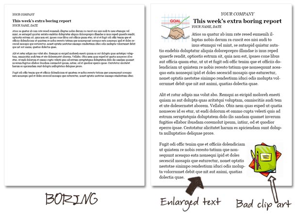
Sometimes you have to design a document around a minimal amount of text–this is often the case with announcements, lists, and those extra boring (and seemingly unnecessary) reports most employers require.
Most of the time, the first instinct is to try to make the content fit the page by enlarging the text, quadruple-spacing the lines, or (god forbid) adding little pieces of clip art.
 Please don’t do this! I will hunt you down...
However, the best way to design around short text is to make the text area smaller. White space is your friend!
Start by dividing the page
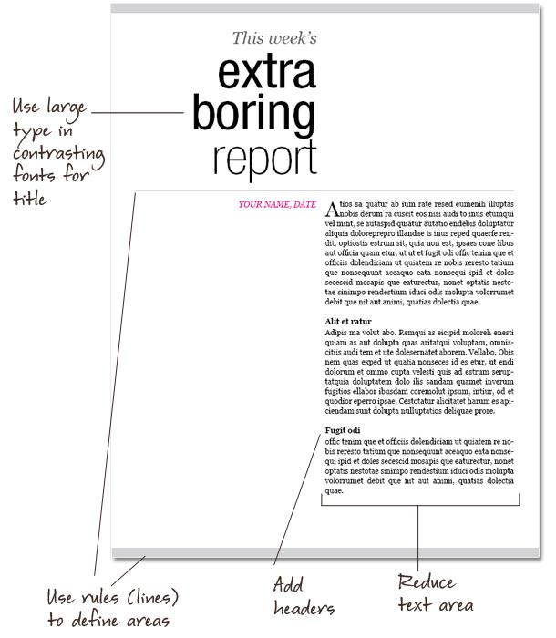
I divided the page in half length-wise, and into thirds horizontally. The text area is limited to the lower two-thirds of the right half.
Have fun with text and design elements
After adding the text, you can have fun with the rest of the page! I like large type, so I changed the title to the fail-proof combination of Georgia italic and Helvetica Neue Condensed. The page is defined with a 6-point horizontal rule at the top and bottom of the page, and the space between the title and the text is defined by a similar, thinner horizontal line.
It’s still simple, yet looks like it would much more interesting to read–which is the point of these documents anyway, right? Try it the next time you have to hand in an EBR!


emily
February 8, 2011 at 9:19 amWhat program did you use to do the layout?
tamia
February 8, 2011 at 8:44 pmI used InDesign, but you could do something similar using text boxes in Word or any other word processor.
Sara
February 9, 2011 at 1:20 pmWow! You have totally proven that even boring things don’t have to be boring. I wish the whole world looked at the possibilities created by everyday mundane things like you do.